The business had previously employed an external agency to undergo workshops and research, to eventually provide recommendations of way forward: to improve the experience of researching, studying for, paying for and taking the qualifications: to gain and retain more customers.
The recommendations made that were relevant and within scope to be achievable and valuable to proceed with, that also were my responsibilities were related to the website, were:
- Improve page layout
The major part of my work was to improve the page layouts of the homepage and the main qualification page, as well instigate what could be done within 8 weeks to create the qualification finder tool.
The information architecture, though necessary, was determined to be out of scope for this part of work. This was completed later by myself - see the other case study.
---
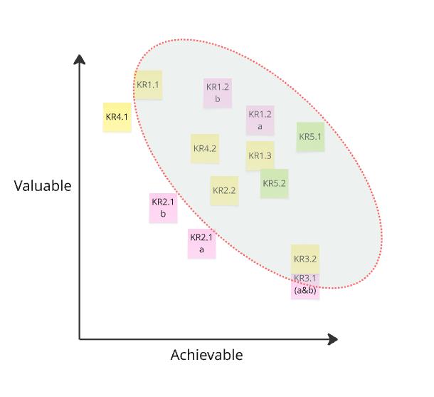
The layouts were confusing, info overload and with text written that wasn't suitable for web. See example below.
This was displayed in the data of a high bounce rate, and recordings/heatmaps from Hotjar that showed users did not follow a path of discovery to conversion.
Unfortunately, there was a limitation of layout configuration and components to use, due to the Umbraco set-up.
There was also a limitation of how much to reconfigure, due to push-back of change and possession of ownership of the website from stakeholders.
As a compromise to the stakeholders, any change would be run as an A/B test with only a small amount of users.
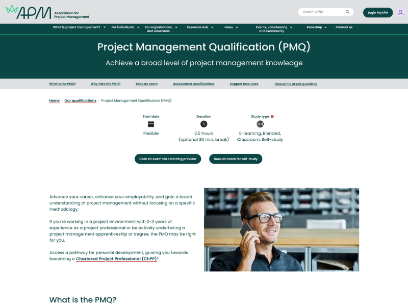
I designed the below, of the main qualification sold, taking into account cognitive load, what were the main actions for the user to take and what info did they need to be convinced to convert.
Ultimately, the qualification is not a necessity within the career of a project manager, but it helps with best practice and career development.
I designed 3 versions, with varying levels of supportive information.
.png)
With this version, I included the page of booking a course via a 3rd party provider. This was on a separate page, but it was commercially sensitive enough to see if it worked within the product page.
.png)
This is the same as above, but removing some content to focus on lessening the cognitive load.
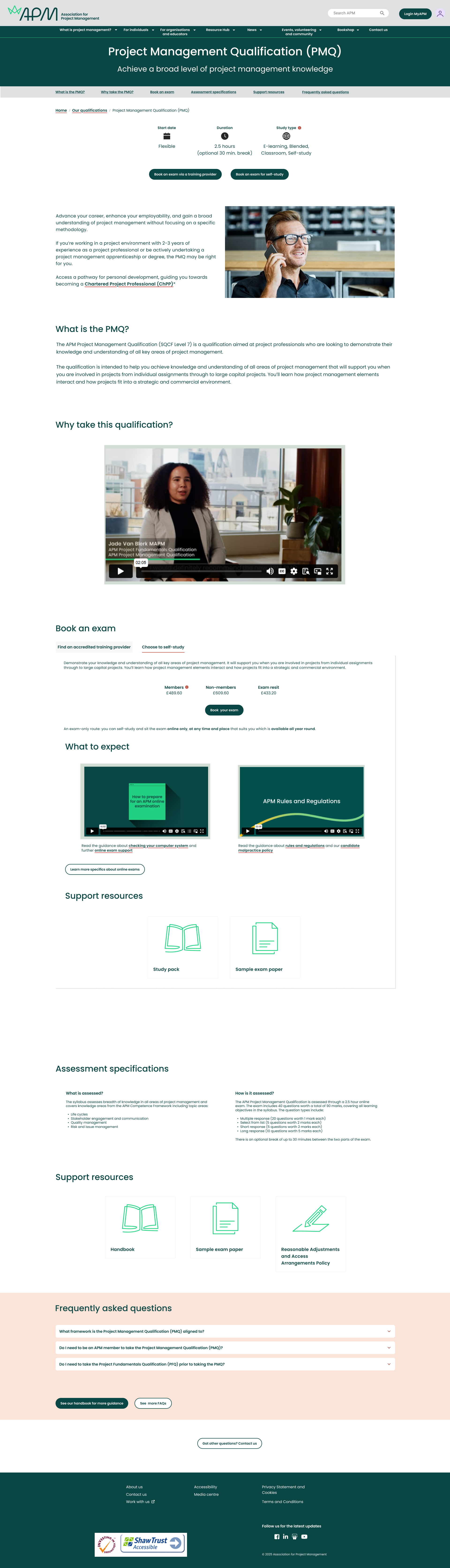
Finally, this version focused on the users need to read and watch additional content to prepare for the exam, with the intention that relieving these unknowns and potential anxiety inducing aspects would ensure an increase in conversion.
Unfortunately, these designs became out of scope for the commercially sensitive need to continue revenue.
What was determined by the Steering group was the need to promote qualifications within the homepage and to have a clearer journey once the user was on the main qualifications landing page.
Instead of designing multiple qualification pages (there are 3 qualifications), I was asked to redesign the main landing page of qualifications.
Customer feedback indicated that they found it difficult to assess which qualification was suitable for their stage in their career or their knowledge about PM.
My goal was to reduce cognitive load, whilst introducing a suitable type of measurement as to which qualification was appropriate for which type of PM.
To help reduce cognitive load, I reused another feature used on the membership page, of additional navigation component.
I decided on 'career progressors' and 'for career starters' to help indicate which qualification was best for the type of PM within their career maturity, but without tying it down to a certain number of years or an age.
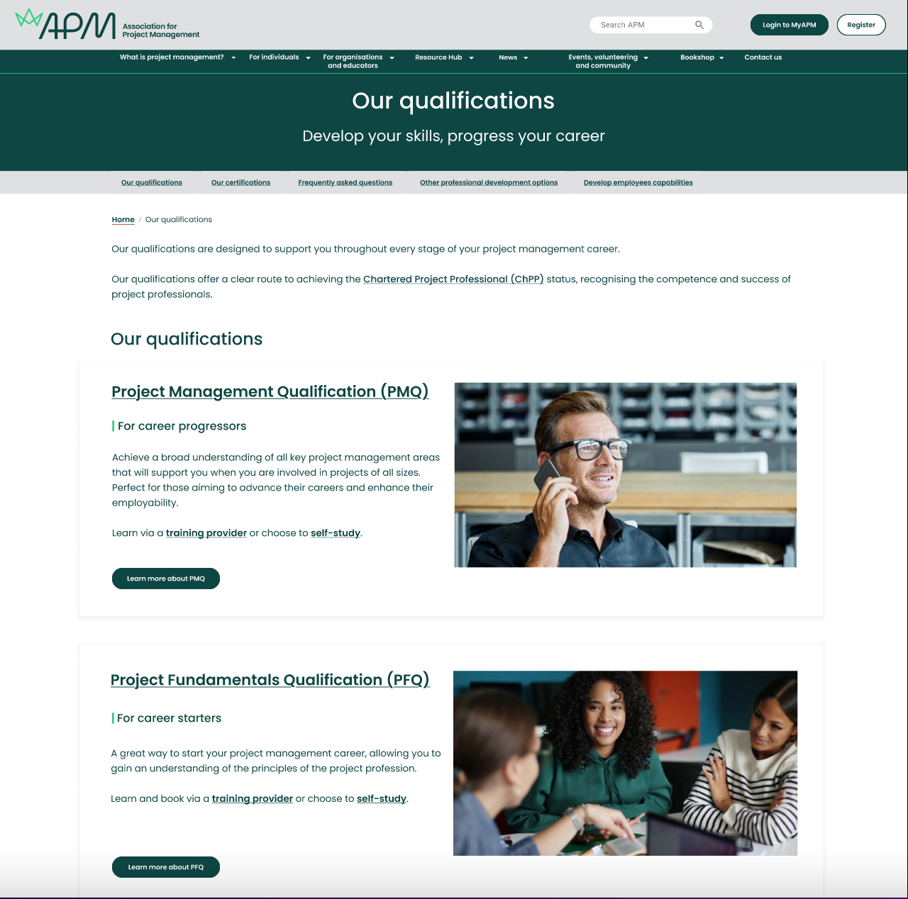
As ever, the design came with the constraint of it had to be an A/B test with 10% of users, for 1 week.
Below shows the end results of several design iterations. Again, the limitations of the components and CMS prevented a design that followed best practices of UX laws and design.
The main aim of this prototype was to highlight what APM was about as a charity: it's mission and target audience.
The next goal was to direct users to its main commercial-driven aspects: delivering courses, delivering a Chartered Standard and a membership scheme for project managers.
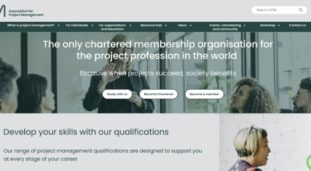
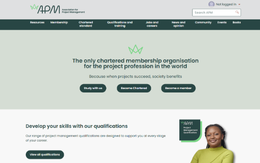
A design was only able to go live at all when the marketing team were happy, under the condition that it was A/B tested with a small amount of users, to meet certain success criteria.
The data did show that

.png)


.png)