With the businesses products and services, as well as the number of members increasing (with an OKR of scaling to 100,000 members across the world), the website needed to match users needs, expectations and showcase its various products and services easily and accessibly.
Part of the foundation of the website navigation was also to ensure that the information architecture and taxonomy used was also matching user needs and expectations: and this research would be part of the solution of the navigation, as well as communication of products/services to users.
---
The current navigation only had 1 generalised selection for the user, which was dependant on the user knowing what the product/service was, and what followed on after selection.

Therefore, the resulting behaviour was the user relying on search, which due to its own problems, didn't serve the results users expected. This results in high bounce results and poor user satisfaction feedback of the usability of the website, as well as a drop in daily users of the services that made up the professional body.
---
Some research had been undertaken before I started the role of UX/CX architect, of tree-testing with users 2 variations of tasks to determine whether a broad but narrow, or narrow but deep type of navigation suits the businesses users best.
The results of this determined that users gave better findability/success rates with the broad but narrow choice best.
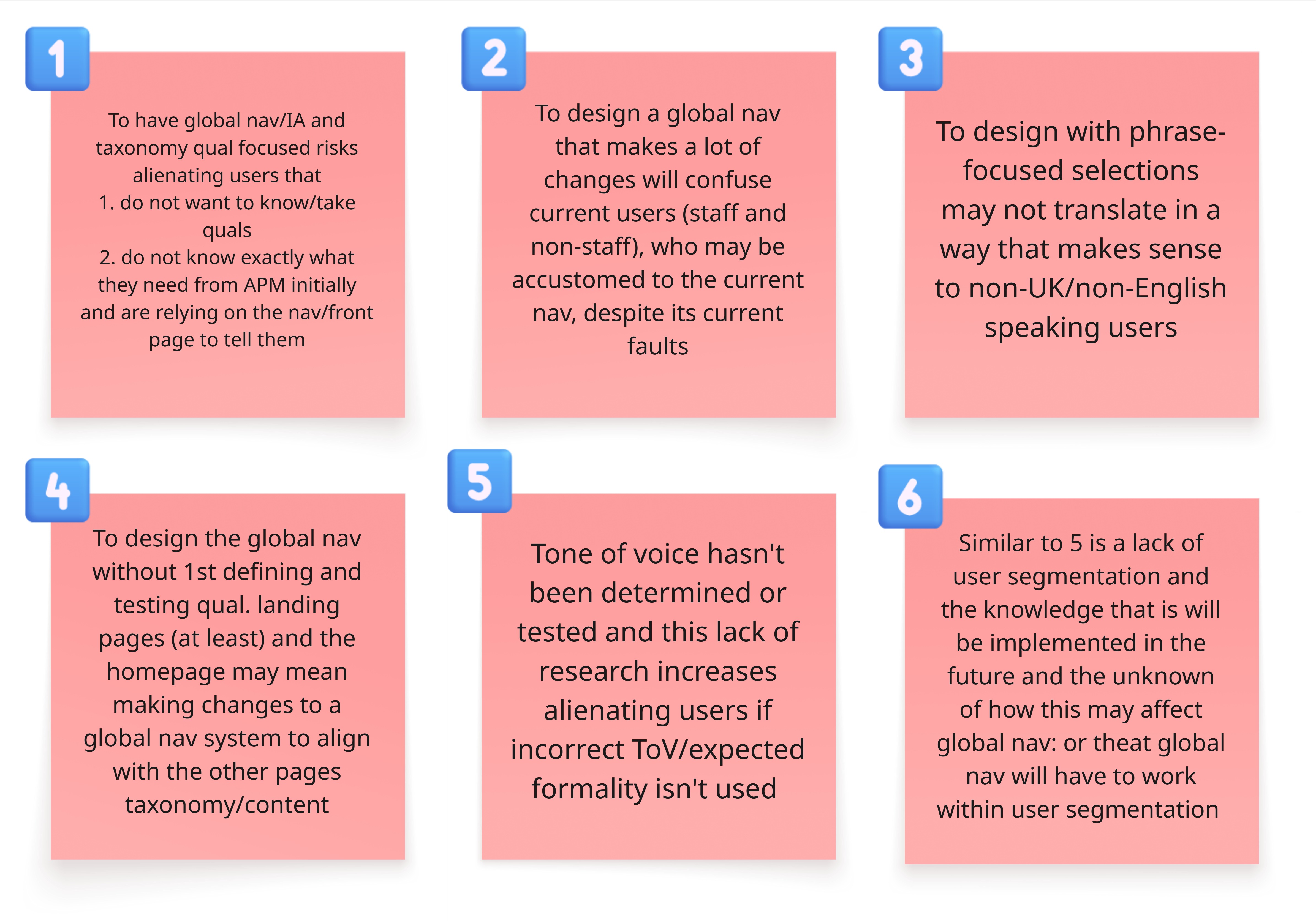
However, the tests were using the current terminology, and further tests needed to determine whether users understood what these meant, as well as the findability tasks.
I listed out the problem statements regarding the issues of the navigation, and collated the known data, collected from a weekly data report of the main revenue products, as well as the website analytics platform Hotjar, and relevant Google Data Studio dashboards.
The data known before any further work started, showed that:
- Search terms used within the website internal search feature highlighted the specific content areas were searched for the most. However, I
-
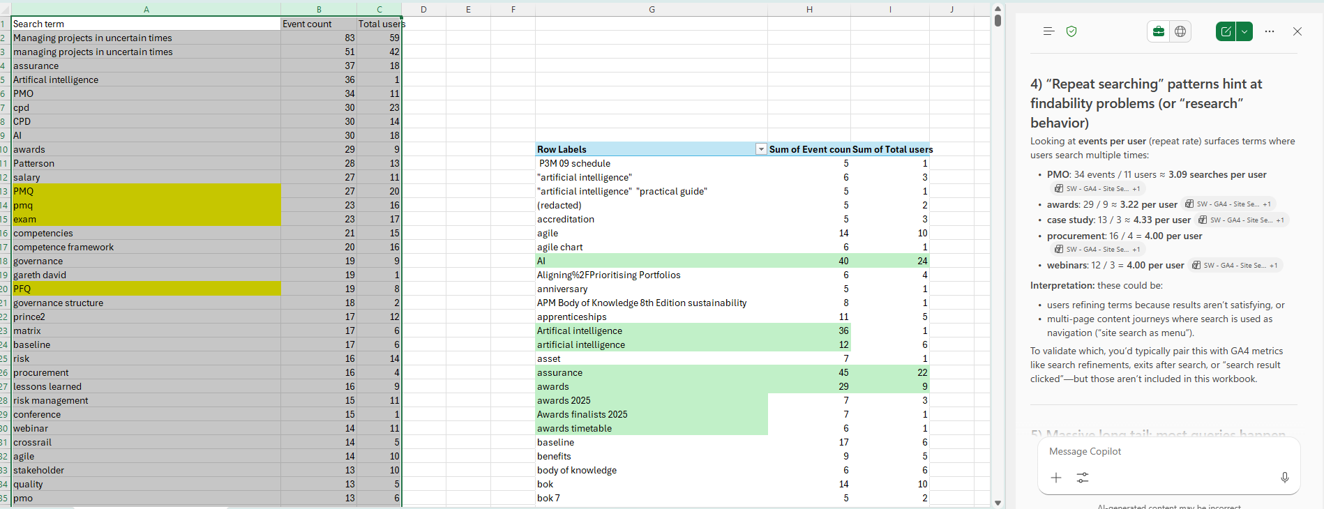
I therefore felt that there was a need for a card sorting exercise, which could help to show whether the terminology currently used, or other proposed variations, would help the user to understand and find the products and services to help them with their jobs to be Done.
Before initiating this, I wanted to know what users mental models, expectations and what other competitor websites were like.

Doing this showed that there was a use of product-led and user-centric terminology, with some sites relying on 3 types of navigation to try to guide the user to an expansive portfolio of services.
I found that navigation succeeded better when there were less choices, with integrated journeys throughout whatever initial navigation choices, that could be backed up by an excellent search functionality, which allowed the user to filter results easily to help with their discoverability.
We looked at ACCA, BCS, PMI and CMI for a varying competitor analysis.
-
I looked at how the current website was performing, using what minimal data was available. This was GA4 data, and Hotjar heatmaps.

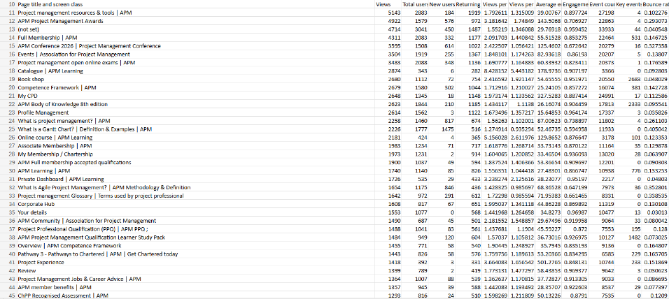
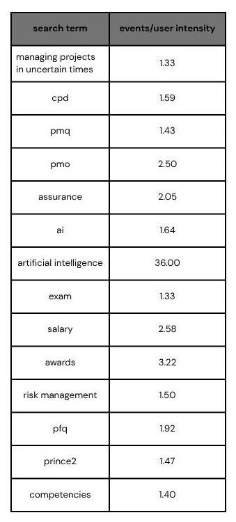
However, only analysing competitors may mean that actual needs and insights are missed. Therefore I searched via Answer the Public, what users are asking search engines.

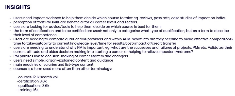
From this, I collated hypotheses regarding the navigation and nomenclature.

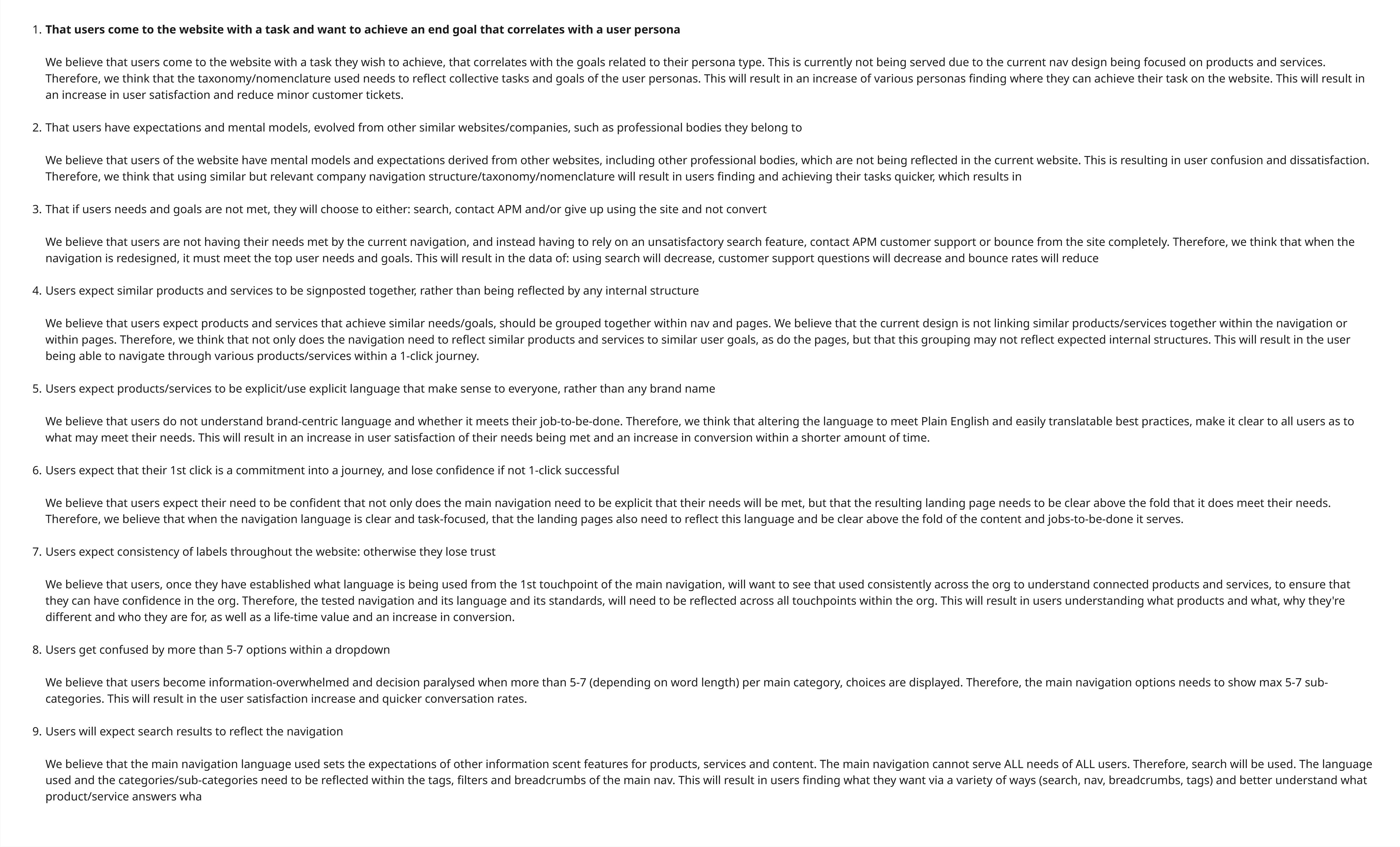
My testing and designs would be to explore each of these.
Therefore, moving forward, I decided to devise 2 types of user tests of card sorting: 1 that focused on product-led terms, with product-focused main categories, with the other type of test using user-centric terminology: however, both would have the same questions (as much as possible) asked to the participant.
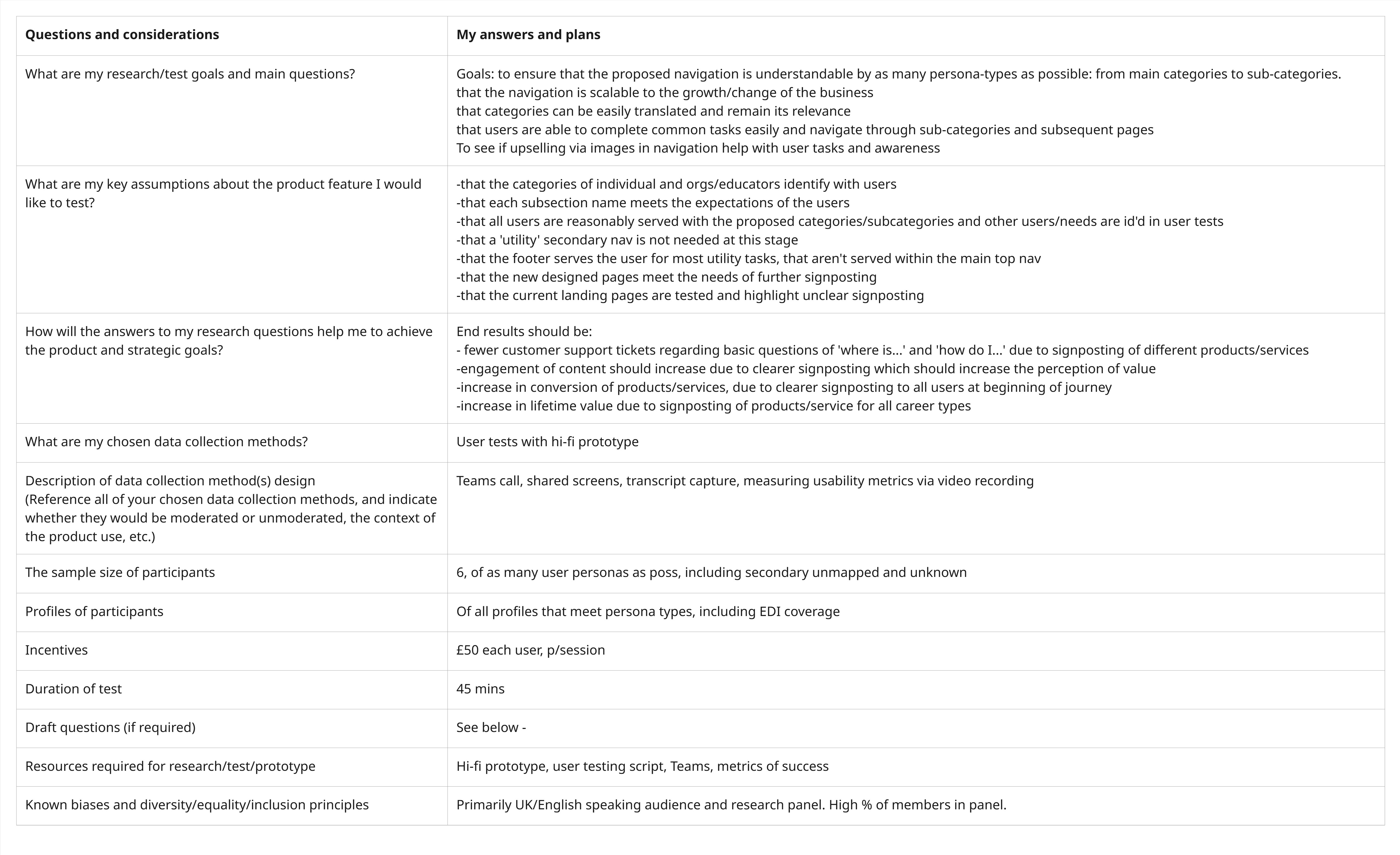
I defined a research plan within a framework to communicate clearly to my manager. User testing would ensure that each user persona type would be tested with.
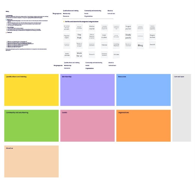
The cards displayed the same or similar versions of current content to categorise, into categories that had been partially defined by the previous tree testing and competitor research.
As the website served both new users and users that weren't PMs, the terminology needed to reflect users that weren't aware of any project manager-type jargon.
The tests were moderated, with an incentive and recruited a wide range of types of users, including those that met the known user personas. It was important to see the difference between users that were familiar with the products/services currently and how they would react to new terminology. It was important to see how new users/not PMs understood the terminology that was partially PM-centric.
I tested with 6 users for each test type, with 2 ‘dry-runs’ done with friends/family members to iron out any potential errors, before testing with the public. I tested with both non-members and members, to corroborate with the type of users that would visit and use the website. Tests were achieved via a 30 min moderated Teams call, with an appropriate incentive. I attempted to represent all user personas and international users as much as possible.
Members had user personas defined by a loose category if their PM experience and intention within their career. Using the Salesforce database and setting up a research panel, I attempted to recruit as many PMs that covered all personas as much as possible.
The results were:
From test 1, users struggled with understanding free vs. paid, passive vs. active, individual vs. org-facing, and prerequisite vs. benefit.
In test 2, users sorted by ‘what I do’ (learn, join, read) not ‘what APM offers’ (m/ship, accreditation, content types).
-
It was decided that user-centric terminology would be explored further.
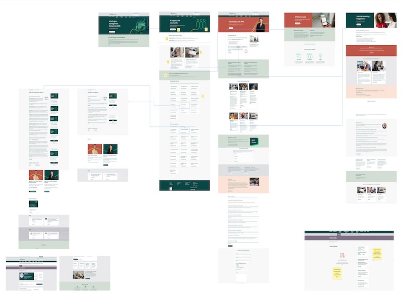
This then inspired some variations of site map diagrams, to establish what a high-fidelity interactive prototype could be.
Prototype testing could instigate clearer feedback, by having something tangible for users to navigate around: but also to determine: did the content of the landing pages of the products/services displayed, meet user needs and expectations of the information/task they were attempting?
We also wanted to test whether images, similar to a competitor, made any difference to the user making a decision or were noticed at all.
Once again, I created 2 types of user testing, this time with Figma interactive high-fidelity prototype tests.
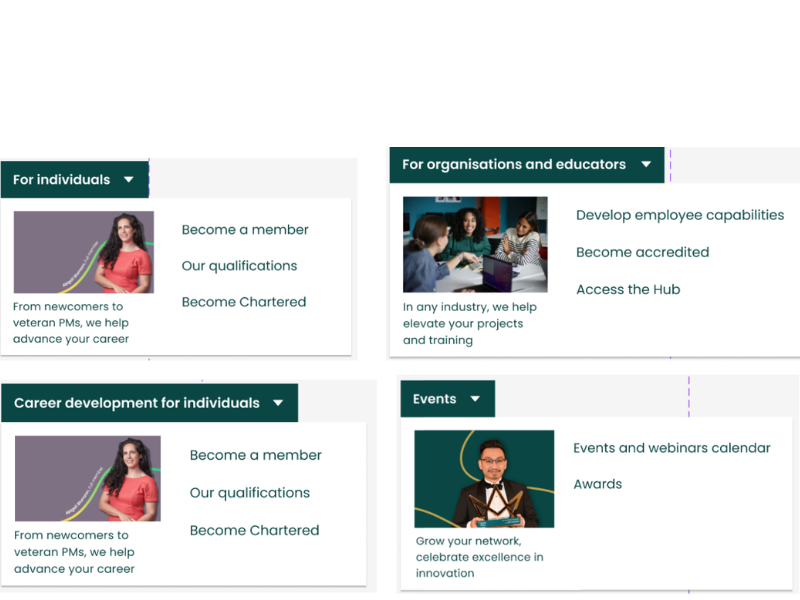
The 1st type of prototype was of simple, dropdown secondary navigation, with any landing pages that existed reused and others created for new navigation choices.
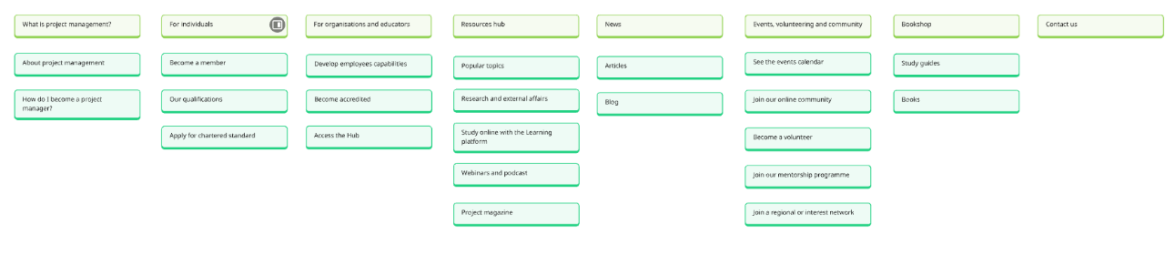
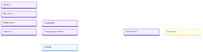

The 1st high-fidelity prototype was designed with no images in the navigation.
The other type was navigation with images in of the core products relating to that category.
The test was made up of a few initial questions about the participant, to establish their persona-type and better understand their familiarity and behaviour to the 2nd part of the user test: the prototype test. This consisted of tasks of regular Jobs to be Done. They were framed as goals/tasks, where, when appropriate, did not use the direct language of the navigation label.
Following best practices and budget limits, I tested with 6 users for each test. Due to budget constraints, I could only used participants that had signed up to the research panel request sent out previously. This mostly consisted of members, and members that were fully bought into the professional body. This bias was a risk to the findings, but to attempt to mitigate, I interviewed those that identified as students: who although were members, were at the beginning of the familiarity of being a PM and using the website.
The tests were moderated by myself, on a Teams call, that also had an incentive.
(img of interactive prototype)
The results found:

Task completion is generally high overall (≈ 96%), but not evenly distributed.
Hardest task: #8 – Training provider accreditation (~67% success)
Easiest task: #2 – Become a member (100% success)
Concepts mentioned regularly were: search (9), cost (4), plus scroll/unclear /terminology
Qual data about confusing labels (e.g. opinion vs research, announcements vs events, qualifications vs accreditation) and difficulty locating pricing.
~17% of recorded destination-click cells mention ‘Resource Hub’.
People appear to trust the hub as a “safe” place to recover when they don’t know where else to go.
How to become a project manager – this was regularly determined to be part of a membership benefit, or that there would be a dedicated resource regarding career management, with 1 regarding communications within qualifications.
Develop employee capabilities – there were an equal amount of users that successfully went to 'for organisations' and also considered the general Resource Hub to a place to explore, before considering further exploration into 'Study online with the learning platform' if there was a need for a formal, structured programme.
Accreditation – Though the task was specific to training providers finding info accreditiation: there was enough noticeable feedback that users considered the term of accreditation (aka a qualfiication or the Chartered Standard) to determine an individuals status within project management.
Mentoring – The task purposefully tested the grouping of 2 separate career progressive services of 'become a mentor or a mentee'. From those that were asked/tested, there was some that saw the mentoring programme as an individual task, as well as a type of volunteering service.
Access the Hub – in displaying a sub-category of Access the Hub underneath the category of ‘for organisations and educators’. Though users expected this may be similar to the Resource Hub, they didn’t understand what these would be.
When asking participants tasks related to become a member, becoming chartered and finding qualifications, the category of ‘for individuals’ was the signpost to go to, especially in comparison to tasks related to developing employee capabilities, and finding information about accreditation for a training provider: organisation-focused products/services.
However, there were a couple of users who expressed that they did have to think about finding individual-defined products/services and compare it to the rest of the options. Understandably, moving away from explicit product-defined navigational choices may annoy regular users.
Overall, most users tested did understand the correlation between individual products/services, and those that were designated for organisations. When testing individual products/services that weren’t explicit to the need of career development, then users could understand that there were other categories to explore that answered the task best.
Colour change
From initial tests, it became obvious that the background green and text size made it difficult for users to quickly identify known words: I therefore changed the background colour to white, the text to brand green and increased the size for better legibility. After doing this, I didn’t have any further feedback related to this.
Other feedback to note
In exploring accreditation, some users were confused by the difference between professional, training provider, academic and corporate.
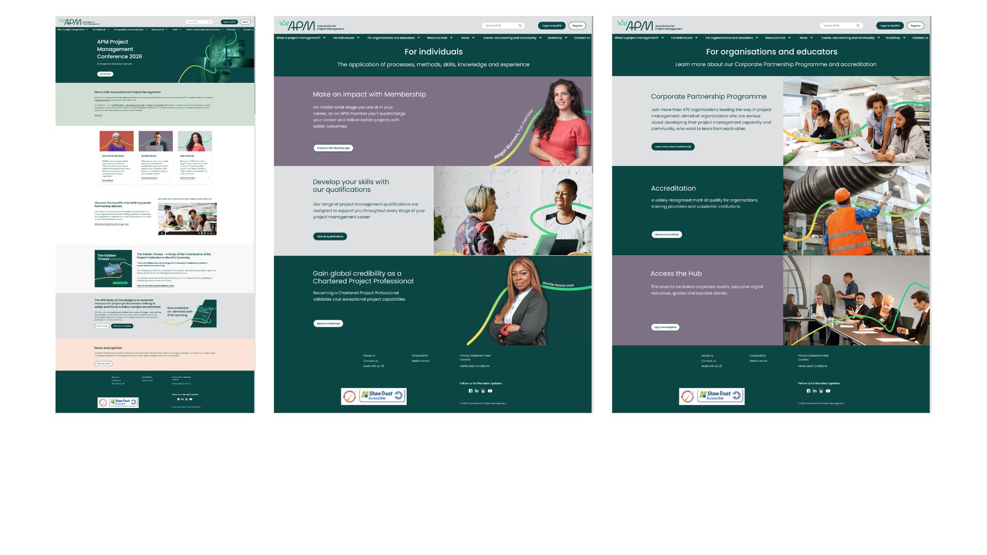
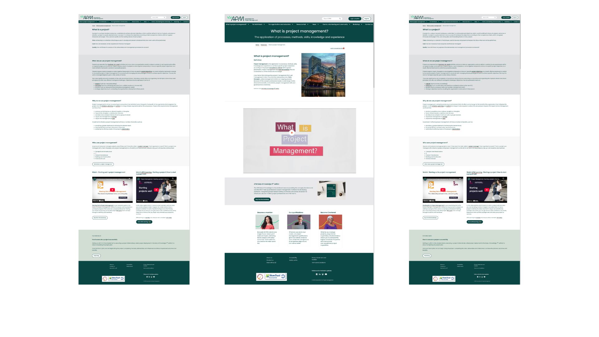
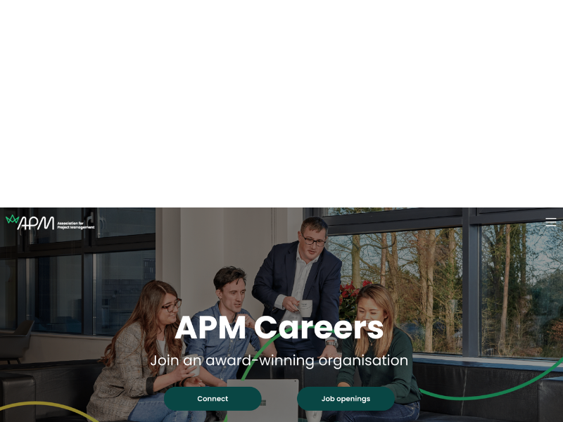
Not tested were mobile versions of the desktop version. These were created to give guidance to developers on how these should act.
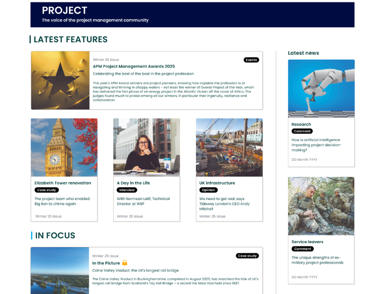
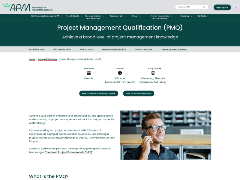
To make the user testing a seamless experience, as well as testing layout and content, I also redesigned some of the sub-landing pages, which was necessary for some new pages.
For current users:
- Any changes need to be explicitly communicated via known channels, as well as via the website, using banners and notifications. These need testing to determine which channel is most effective, or be able to publish once and display in multiple settings.
- A dedicated published changelog could also help with user-brand communication relationship
- Clearer awareness of the ‘corporate hub’ for those linked to a corporate partner and leads, within partnership pages but not the global navigation
These changes will help to ensure that content has a clear content structure, that can be scraped by search engines/AI and deliver relevant results for the user need.
- Remove the terminology of corporate and replace with organisations and educators, with further definition of professional development training providers, and academia, which encompasses universities, further education, colleges.
The research indicated that users could clearly understand information best when simple lists, and tiles/cards were used to communicate. Sticky navigation also helped to highlight related products and services / sub-categories, related to the main product. Ie. Membership –> membership benefits.
Therefore, enlist this within qualifications, chartered standard, research, resources and community & volunteering landing pages. Implementing this sticky navigation informs, guides and strengthens engagement.
Specific and obvious buttons for logging in/registering, above the main navigation will improve navigation and engagement with the products/services.
A specific and obvious button for the myAPM dashboard above the main navigation, as well as overall strengthening the value of the myAPM dashboard within the user journey will be another place of signposting, navigation and engagement for registered users, ‘corporate partnerships’ and members.
Further research and alignment of business strategy to international needs will indicate how the UI can serve user and business needs of translation, localisation, and whether separate websites are required for international users.
- Initial tests of translations of prototyped global navigation designs indicates that the global navigation choices need to be limited, controlled to respond to user needs and tested for understanding of translations.
These tasks require personal information to be communicated without reliance on email/phone communication – automated or not. Therefore, the myAPM dashboard needs to highlight and respond to each of these user tasks.
Limitations
Risks

.png)


.png)