Payment for the platform was done via a manual process of the Finance team issuing invoices. With the intended scale-up of the business, this was unsustainable. Therefore, the business started the process of utilising DUNs numbers for organisations to confirm to sign-up with. This approach was intended to reduce data duplications.
Previous UX/UI work had made the sign-up process have the feature of the user selecting the number of facilities that required licenses to be paid.


The question was: would people signing up understand its use and if the data wasn't correct, how could we prevent errors?

The research and definition of the problem had been completed by the time I was asked to be involved, as had most of the signup form design. Therefore, most of my work was focused on successful and multi- user-onboarding.
I created a user flow diagram to show to stakeholders the differences between user journeys of a Key Account Manager (data showed that this type of user was more common than others): who created the account and paid/sent payment to a colleague, as opposed to someone who created facilities within the account.
There was further user segmentation work diagrammed and researched, based on job title analysis and interviews. With these groups defined, it helped to define the appropiate microcopy and design of onboarding.

Previously, onboarding was a singular information box, with lengthy text. I wanted to make it simple but still relevant for the most likely types of users who was applying. User segmentation work had been carried out and I explored ideas of making the onboarding customised, but there was a tight deadline as well as a need to deliver a cheap solution.


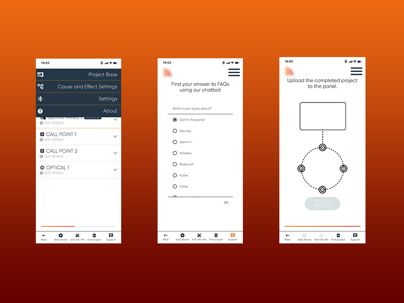
As diagrammed below, the onboarding wizard showcased a stepper that took them through the basic needs/asks of inviting users and creating a facility, which also asked the account creator to 'assign' a user to the fcilityeng created.

As part of the payment section, an update I designed was to make the 1st sign-up form less lengthy. I moved the step of license selection to another page for clarity. This meant more detailed instructions could be added.

See the sign-up and payment prototype here.

Demo of the MVP of sign-up, payment and onboarding.
The impact was still being measured and analysed by the time I left the company.


.png)


.png)