HabitHero is the MVP that is the main case study on my Kings College London UX/UI design course.
The background is:
PrimeCare is an insurance company based in the United Kingdom with a focus on prevention. At the time of its founding, this was a radically different approach from traditional insurance companies, which focused on providing support only once people had fallen ill.
As the general public became more aware of the importance of wellness and healthy lifestyles, many people sought out insurance providers that aligned with these values. PrimeCare met this growing demand by providing insurance products that helped people to live healthier lives.
The target users for HabitHero are individuals who want to improve their health and wellness and are open to using technology and incentives to achieve their goals.
Age
Adults of all ages, with a focus on those in the 35–50 age range who may be at a stage in their lives where they are more concerned with their health and wellness.
Health status
People with chronic conditions or who are at risk of developing them, as well as those who are looking to maintain or improve their overall health and wellness.
Education and income
Individuals with at least a high school education and a moderate to high income who are likely to have the resources and motivation to invest in their health and wellness.
Lifestyle
Health-conscious individuals who are interested in physical activity, healthy eating, and other wellness-related behaviours and who are likely to be tech-savvy and comfortable using mobile apps for health and wellness tracking.
Released as an MVP one month ago, the HabitHero app currently has the following functionality:
Automatic tracking of daily steps using the smartphone’s built-in accelerometer as well as integration with wearable devices and incentives for reaching daily step goals, such as rewards.
The reward system for HabitHero works by allocating points for healthy behaviours and habits. For example, members earn points for - completing an essential health screening - physical activity, including daily step tracking.
The North Star metric is monthly active users (MAU). By focusing on increasing the number of monthly active users, HabitHero can ensure that its user acquisition and retention efforts are driving sustainable growth and that users are finding value in the platform over the long term.
The key results for HabitHero are as follows:
- Increase new user acquisition
- Increase user retention.
We started by analysing the current MVP app.
We were asked to analyse the UI and UX in accordance to known design principles and providing recommendations.


My recommendations were:
Moving forward with these recommendations adheres to multiple design standards that fit the categories of aesthetically pleasing and minimal, through consistency. Regarding the focus of the health data, goals and activity levels, recommendations to improve:
These recs align with Rams ideas of Good Design: ultimately to make the product innovative for the user to help them be their best self, useful in giving them achievable and visible goals and understandable, by making lots of data easy to see, understand and gain insights from.
The given problem statement was:
My analysis of this given problem statement were:
Underlying issues could be:
From this, we were asked to identify knowns, unknown and assumptions.


From these, we were asked to develop hypotheses that we wanted to explore further.


I've chosen these to test as these target the main features of the MVP, rather than build untested features.
The first 2 target the initial onboarding experience with a drive to make the experience shorter and focused only on the necessities. This is important for user retention: a bad impression could mean user drop-offs shortly after signing up.
The others are more focused on optimising the current features of the app: testing to see whether the concept of customisation of their type of fitness, goals and viewing choice makes for a more useful and persuasive tool; for the need for constant motivation. This aligns with the need for increasing user retention: if the app can serve as a customised tool, then it will appeal to more and all, continuously.


I started with a Google Forms survey and recorded my results. See below for the responses and my analysis. I highligted key terms to extract important points.

.jpeg)
.jpeg)
From these results, I consolidated the main findings to create the persona I was going to concentrate on, going forward within the coursework.

A scenarioed user journey map showcased their needs and avoidables through each main step of the product, which highlighted potential development oppotunities.
A user scenario statement rounded up the motivations and needs that the product could help to have an impact in.
Was the original problem statement still relevant with the findings discovered?

After this new problem statement defined, I created HMW questions of how I could alter the MVP for the user personas, the user needs and the business requirements.
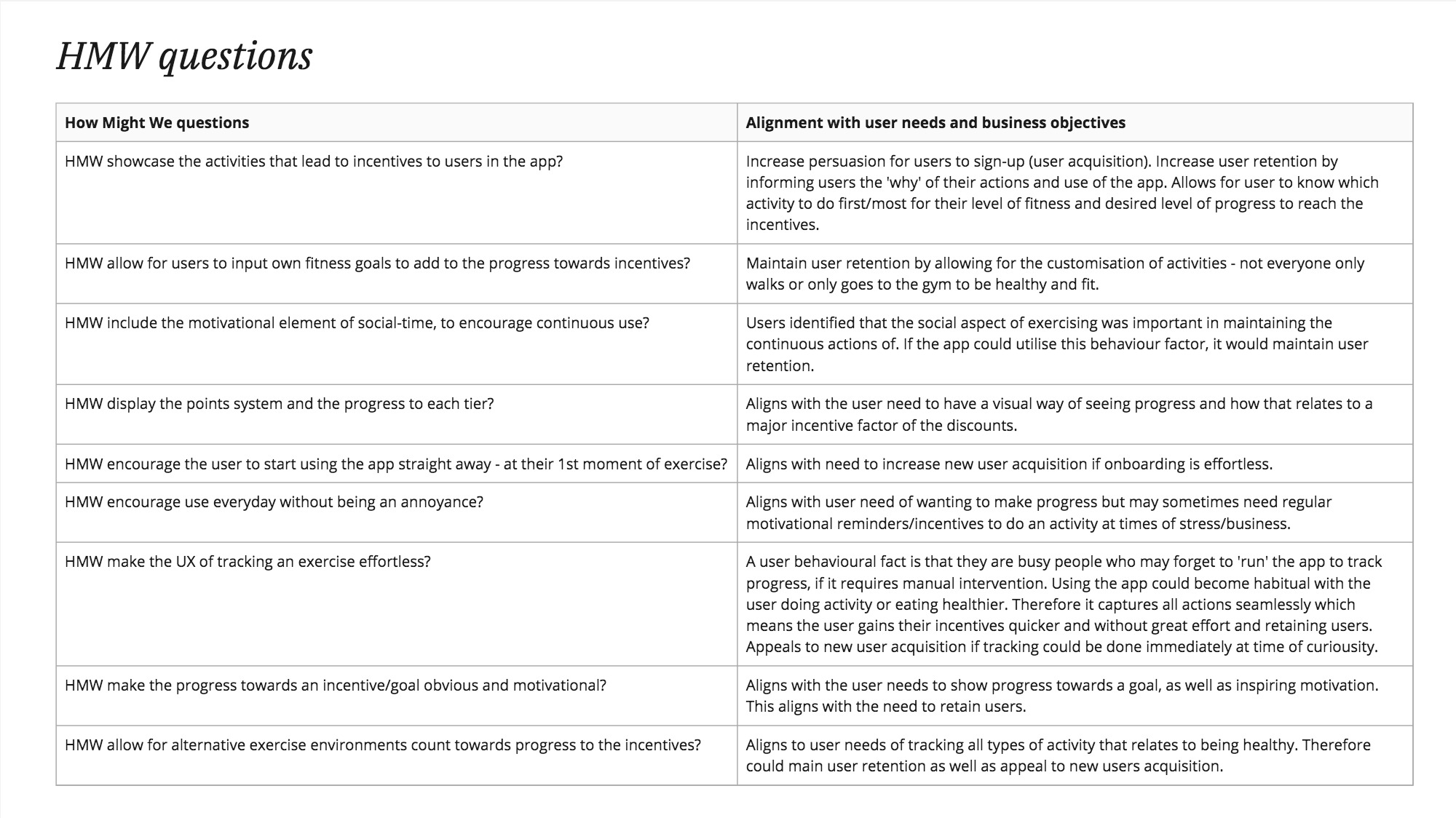
Presenting these HMWs to stakeholders needs further thought as to whom should be part of the continuing meetings.
.jpeg)
I created and narrated a presentation of the key findings found within the user research, and potential future design development

Part of designing for success is defining what success is. The goals-signls-metrics framework aligns the overall goals to what indicates that. Users signing up, succesful onboarding completion, retuning to use the app and not deleting it are minimal achievements.
Ideation followed: I used the SCAMPER technique to ideate to the chosen HMW question of improving the timeframe choice.


With the ideas, I ranked them by their likely feasibility, viability and desirability.

Out of the ideas that ranked well, I filtered them further using the Eisenhower Matrix.

Further questioning of the main idea chosen was required to ensure I understood the pros and cons going forward.
I took the idea further of allowing the user to have more choice and visual diagrams of different timeframes of their progress and activity, into a user flow diagram. I diagrammed the optimum and an alterntive path: how the user could see in an instant after login, how they were progressing. However, I wanted to express how the user could find his information elsewhere and not straight after login.

The flow diagram help to envisage what should happen; the small logistics and helped to define edge cases.

The optimum user flow and the user need was put into perspective of what the user is likely to be doing when having a problem and needing it to be solved.
The storyboard envokes empathy and highlights a possibe, likely real-world user need scenario for the hypothesis in action.
I ideated further, using low-fi drawings to start mapping out potentials. I made these clear for ease of communication withh stakeholders.


See the mid-fidelity prototype here.
Part of prototype/product design is user testing and iteraing on the feedback. I created a user research plan, to define what I wanted to find out:
I was to moderate 2 sessions, first asking questions, then to user test with tasks.
I wanted to understand whether my prototype:
My testing script was designed so that anyone could do the testing.
Intro
Before we start, I want to remind you of a few things.
We're testing our app, not you. If something doesn't work, it's our software's problem, not yours. There are no wrong answers here.
Please try to act naturally while using the app, as if you were using it on your own without anyone watching.
Think aloud as you're using the app. Share your thoughts, such as where you're navigating on the page, why you're clicking somewhere, and what you expect to happen. Feel free to ask any questions you have, and I'll answer them as best I can.
Please be honest. If something doesn't make sense or isn't working properly, let us know. Your feedback is valuable, and you won't hurt our feelings.
Background questions
I'd like to understand your background use and knowledge of measuring health and fitness, so I'd like to ask a few questions before we start the tasks.
Have you ever used a health/fitness measuring/tracking app?
Have you ever tracked good habits and/or day-to-day achievements?
Do you have daily and/or weekly goals you wish to achieve in order to self-improve?
When you haven't managed to achieve a daily or weekly goal, how does your behaviour change?
Tasks
Now, let's begin. I'll start recording your screen.
First, take a moment to explore the homepage and describe what catches your attention.
Then, the tasks I would like for you to attempt is:
- Check what your goals for today are to complete.
- How many goals are there to achieve each day?
- Then, I’d like you to see if you have managed to achieve any goals this week.
- Great. Could you please find the information to understand whether you managed to reach your step count goal of each day within a week.
- How would you find out what activities you did during the week that helped you to achieve the goals?
Wrap-up
Thanks! That’s the final task. I’ve stopped recording your screen and stopped recording audio.
Before we wrap up here, I’d like to ask you a few more questions regarding your thoughts of the prototype.
Can you share your thoughts on how the features and information are arranged on the screens?
What were your thoughts on the charts you saw?
What were your thoughts on the navigation through the app?
On a scale of 1-10, 1 being bad, 10 being excellent: how do you rate your experience with the app as it stands so far?
Once again, thank you for your time and your feedback.

A video of the prototype in action.
My user testing findings and conclusions were summarised into a presentation.
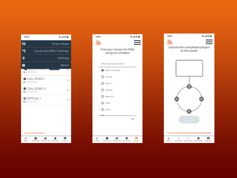
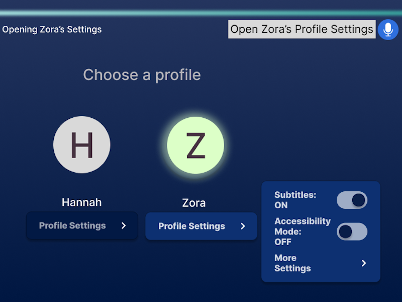
Further development on the prototype was to create high fidelity prototype of 1 user flow.
.png)


.png)


.png)