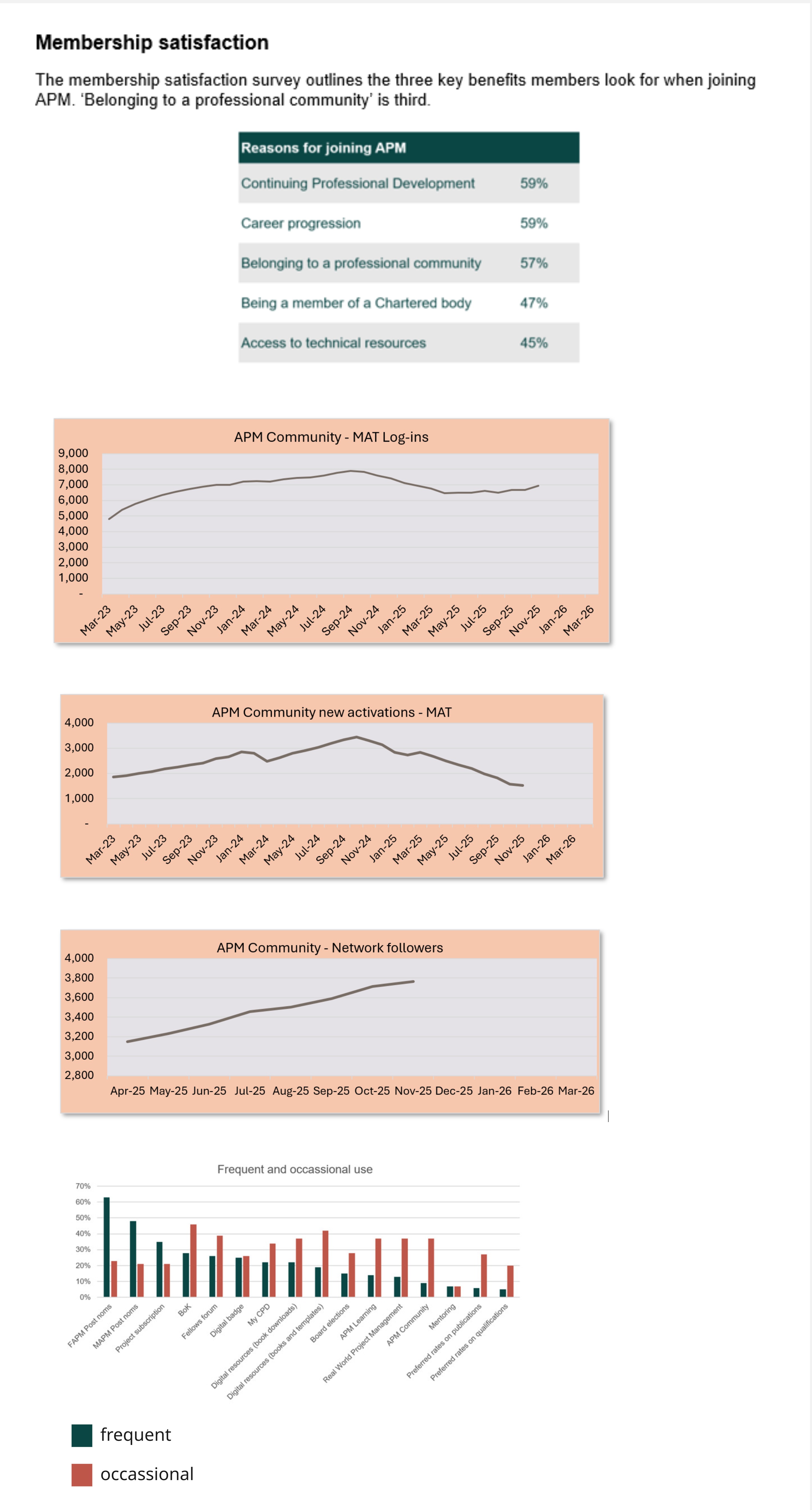
The premise was that the community aspect to a professional body was considered important to its members: but the data stated that numbers of users, using the products and services that made up community, had dropped and were still declining.
The website navigation and search features were not meeting user needs and these were slowly being improved within other, simultaneous work initiatives.
However, the aspects of community, though didn't provide direct profit, were considered needed and valuable to users.
The aspects that made up community were:
- regional and special interest networks that ran meetings for its members online and in-person across the world.
- an online forum, that was also formed of the online versions of the above
- which hosted a paid-members only mentoring programme
- and separately, ran a volunteering programme with varying types of roles that could be accessed for members and non-members.
It was therefore necessary to start researching as to why the numbers had reduced, and the impact on the overall CX understood.
From here, I wrote a general problem statement and created a research plan to understand what I needed to know and what was already known.
Initially, I started gathering data that was already available within the business and competitor research.
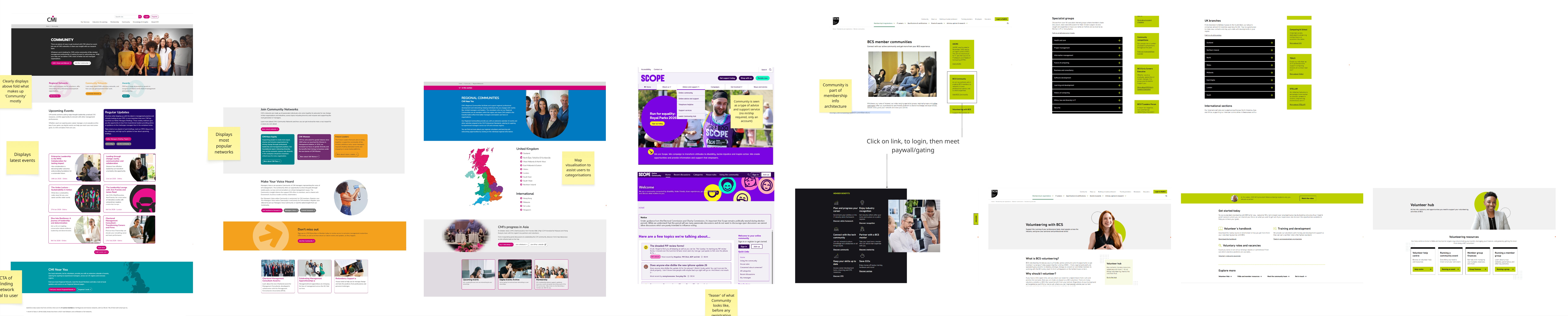
Other professional bodies and charities approached the concept of community as both an online forum, regional and regular events, that were free, paying and a mixture of member and non-members only.
The main source of data known that sparked the request for the UX/CX team to investigate, was from the annual membership satisfaction survey, where members answered multiple questions regarding their views on their membership.
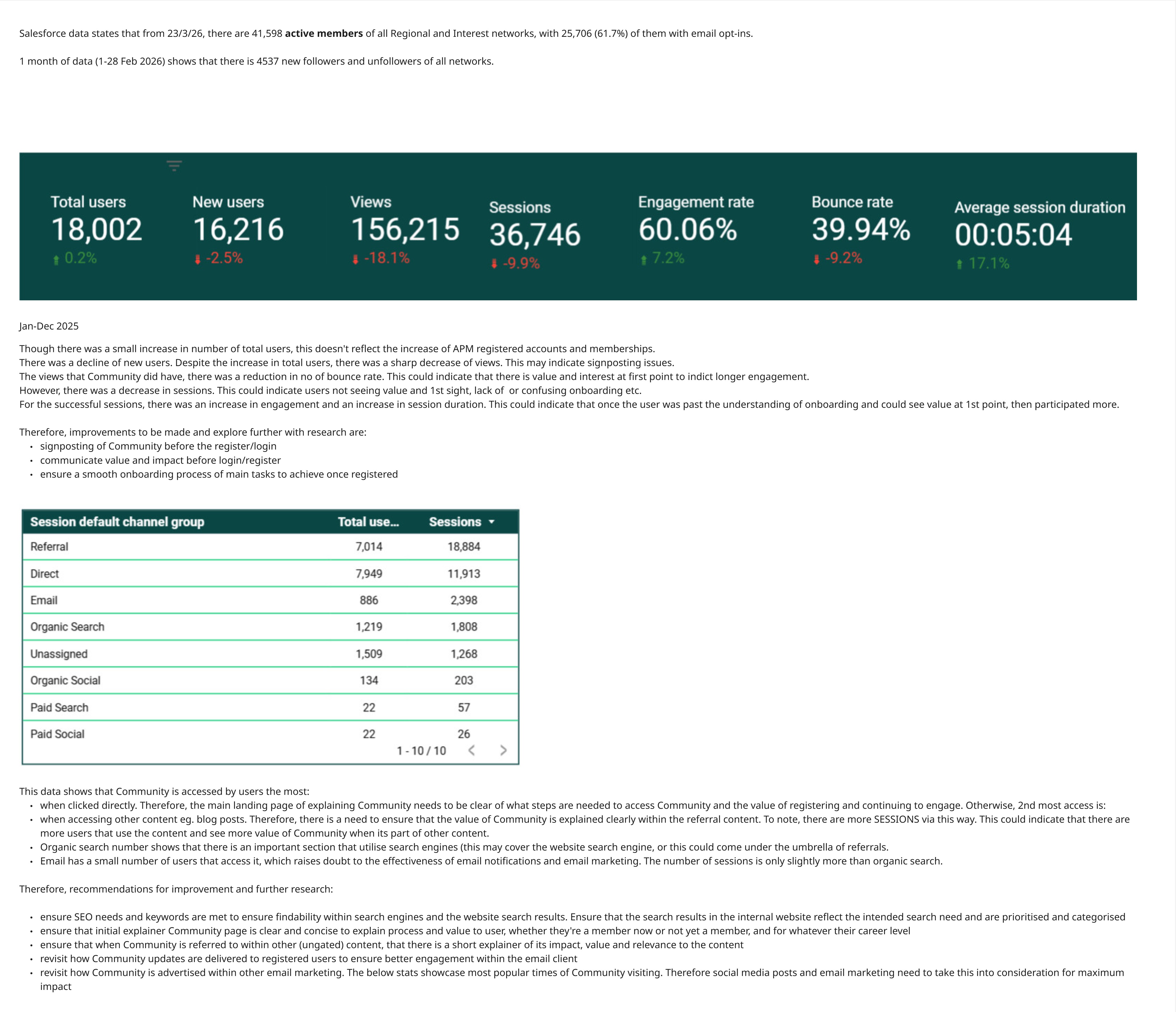
The business used Salesforce as its CMS and was a source of data reports. These reports gave information on the number of members for the interest and regional network groups.
I also found data regarding the number of volunteers and role types.
APM relied heavily on the online forum to host aspects of community, but it did start as regional in-person events. These expanded to also focus on career-specific sectors of PM.
Events were hosted online and in-person, with several main events for anyone.
Next, I felt I needed to understand what users were experiencing with the UI.
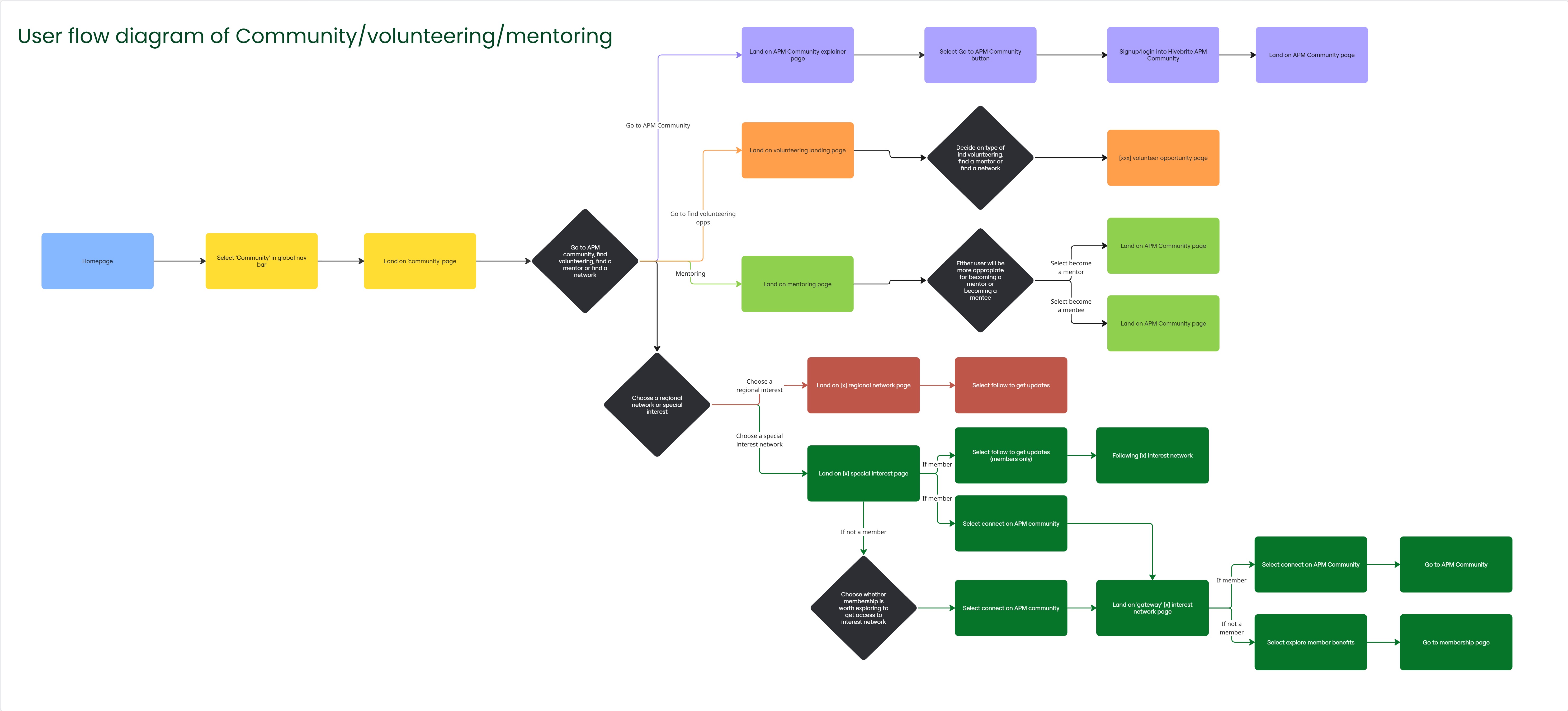
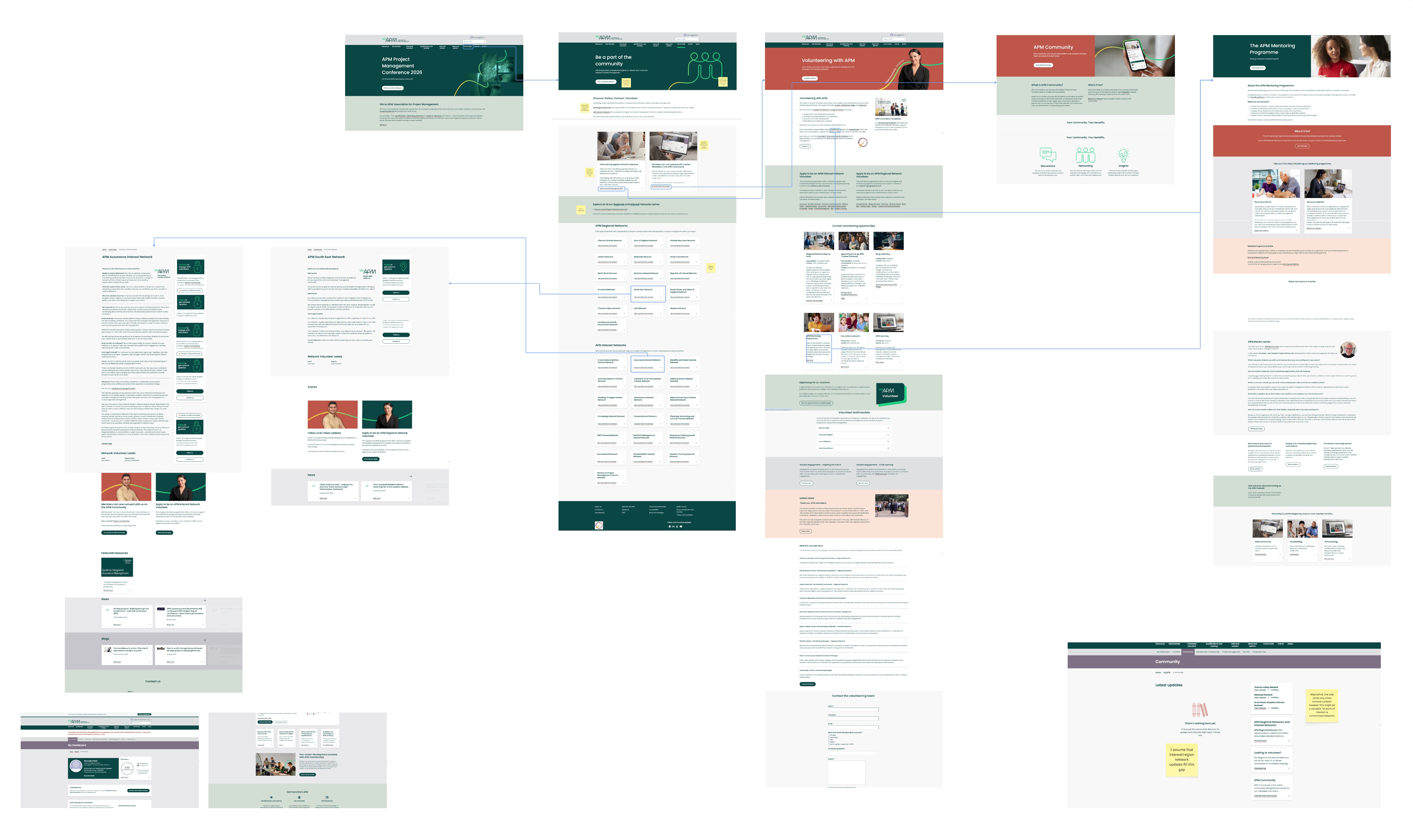
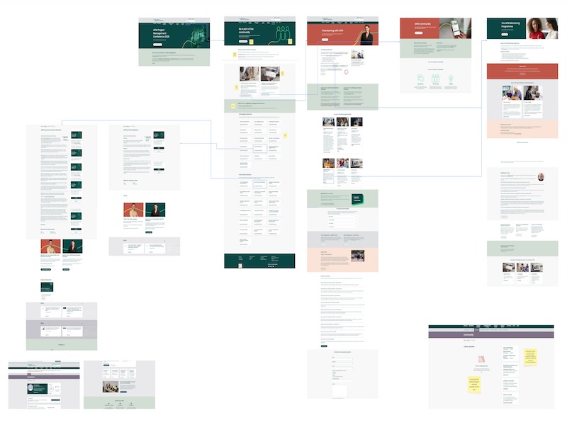
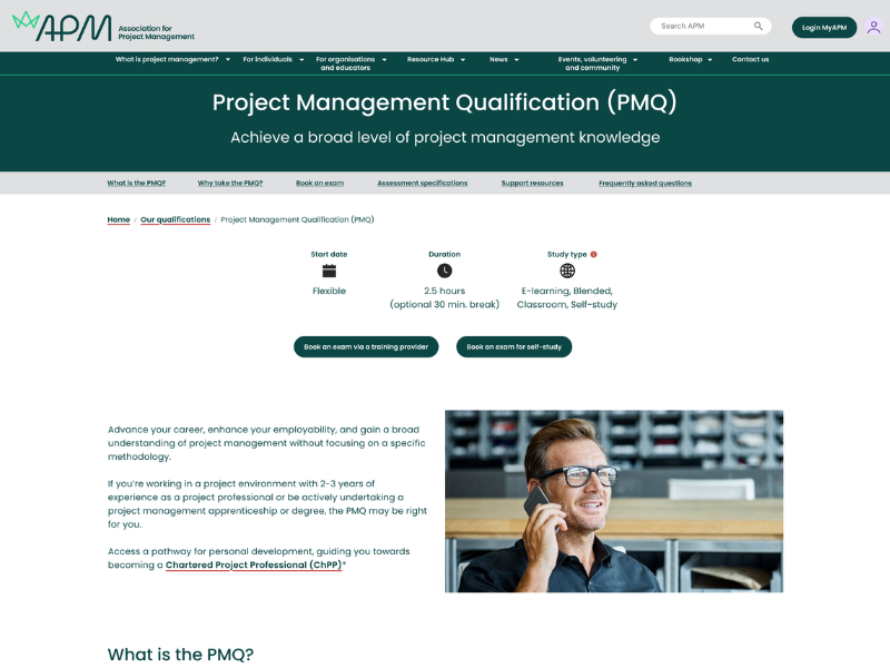
I started by taking screenshots of the current website and the platform of Community, hosted externally using Hivebrite. These, along with an as-is user flow diagram, made clear what the various products/service were that made up community within the professional body. Here, I could understand the pain points within the journey.
This was only the frontend journey mapped, with the entire service blueprint to be completed in the future.

From here, I took a closer look at Hotjar analytics.
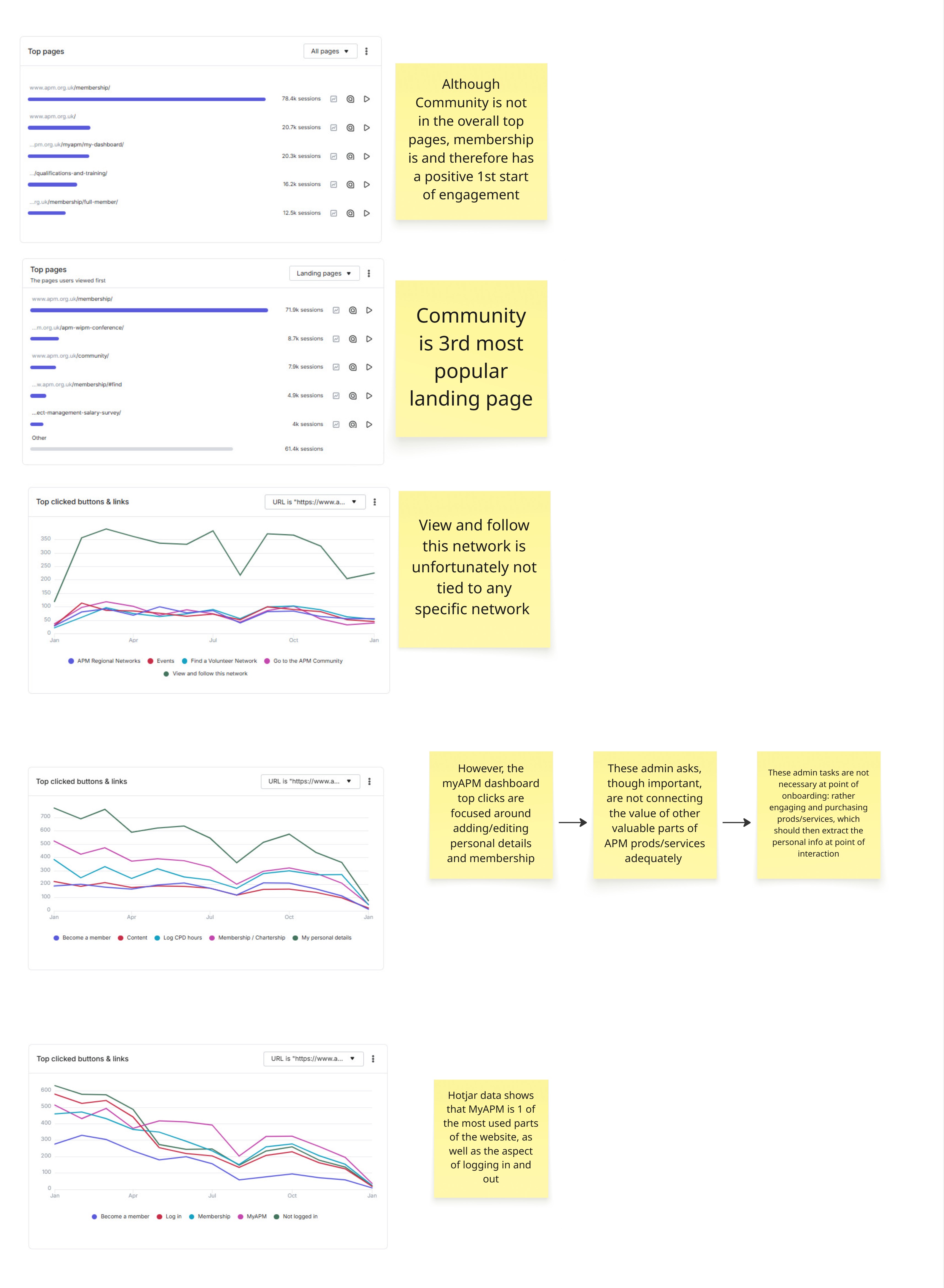
I contacted the product owner of the digital platform forum, titled Community, to gather data specific to the Hivebrite platform, as well as garner their understanding of user interactions. Part of their responsibility as product owner of the online Community forum was to host Community specific content webinars and write engaging posts to encourage member discussions.
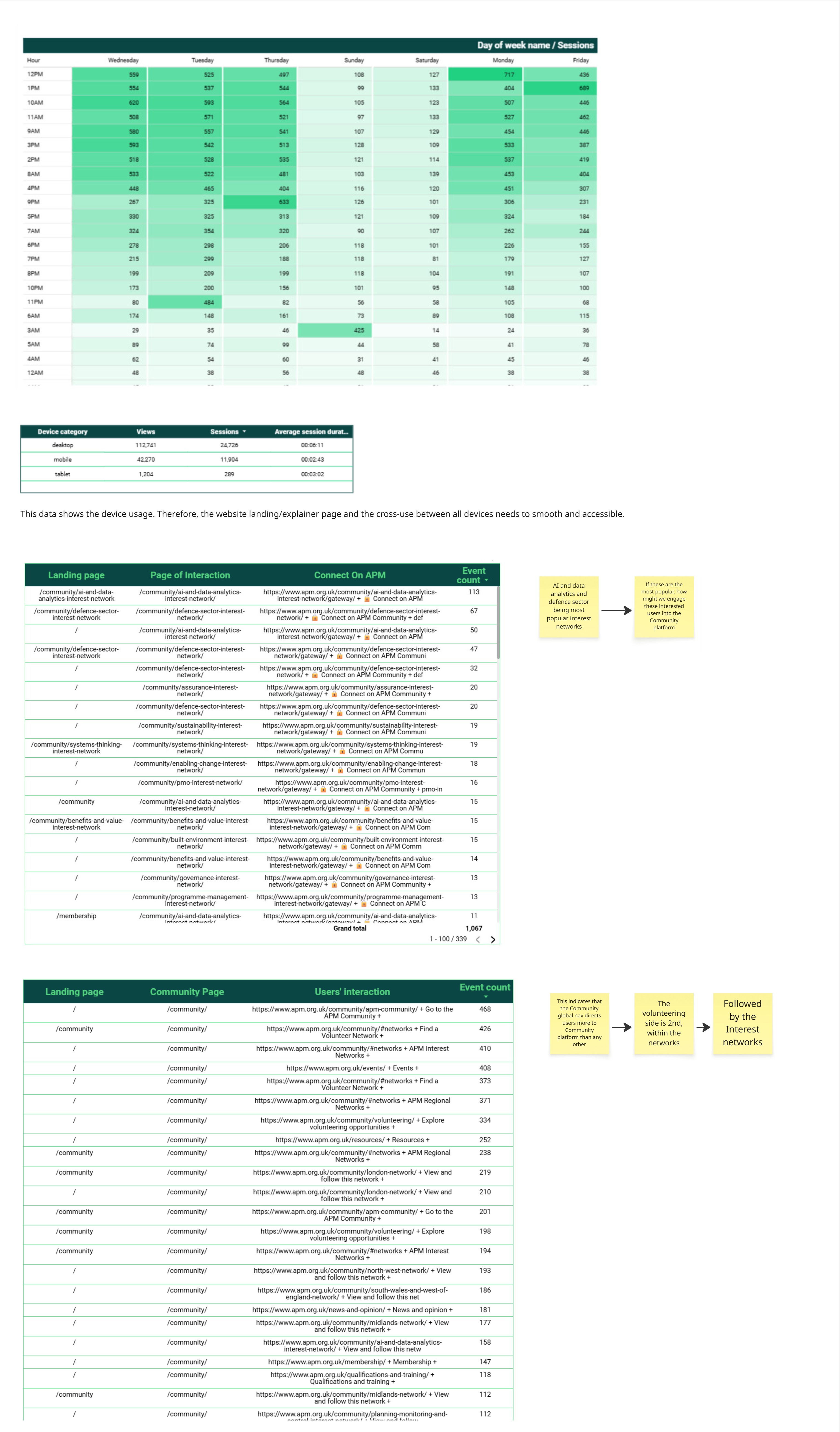
The data given came directly from Hivebrite, as well as a Google Data Studio board that linked these external platform stats together with the main website engagement and conversion information.
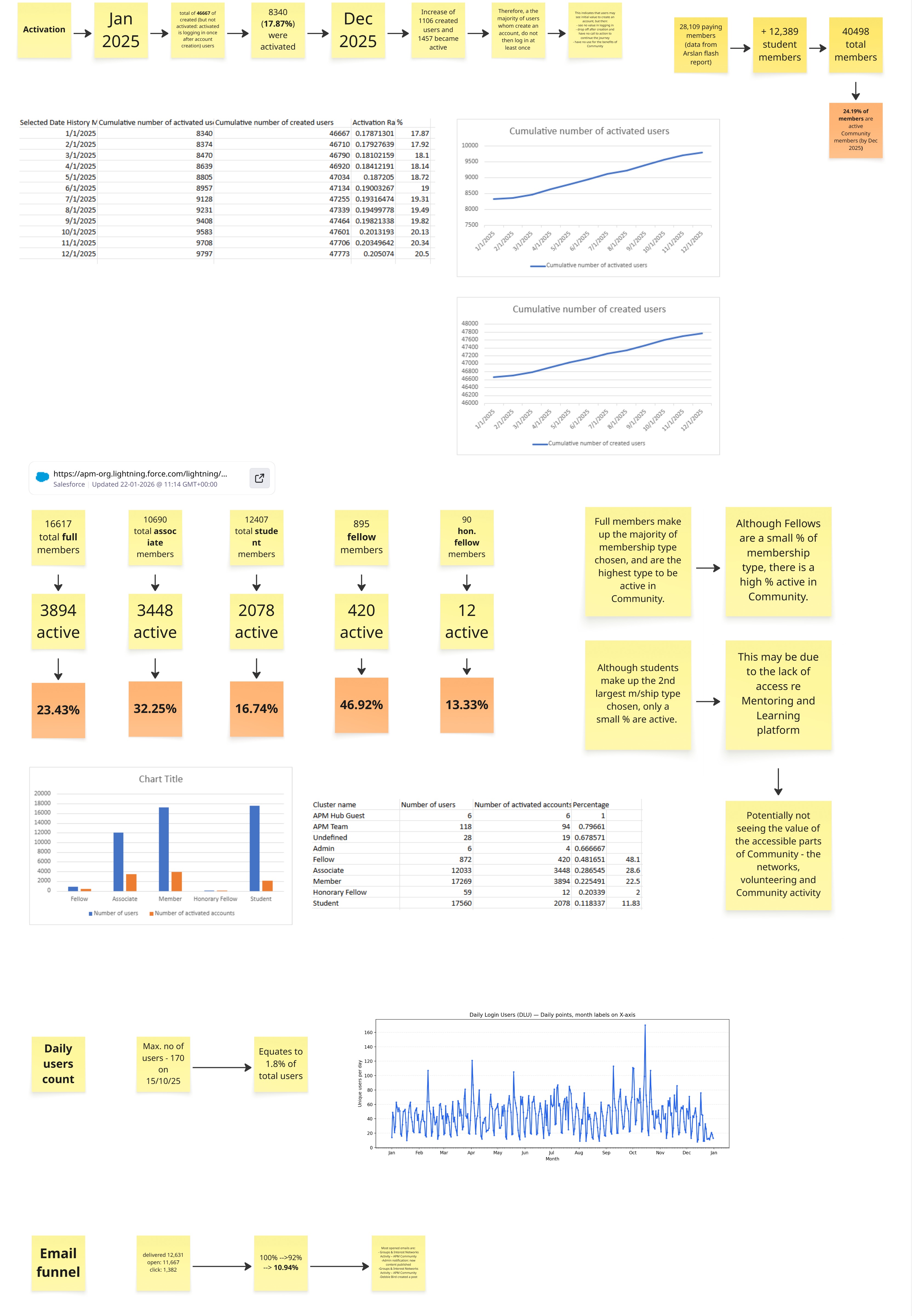
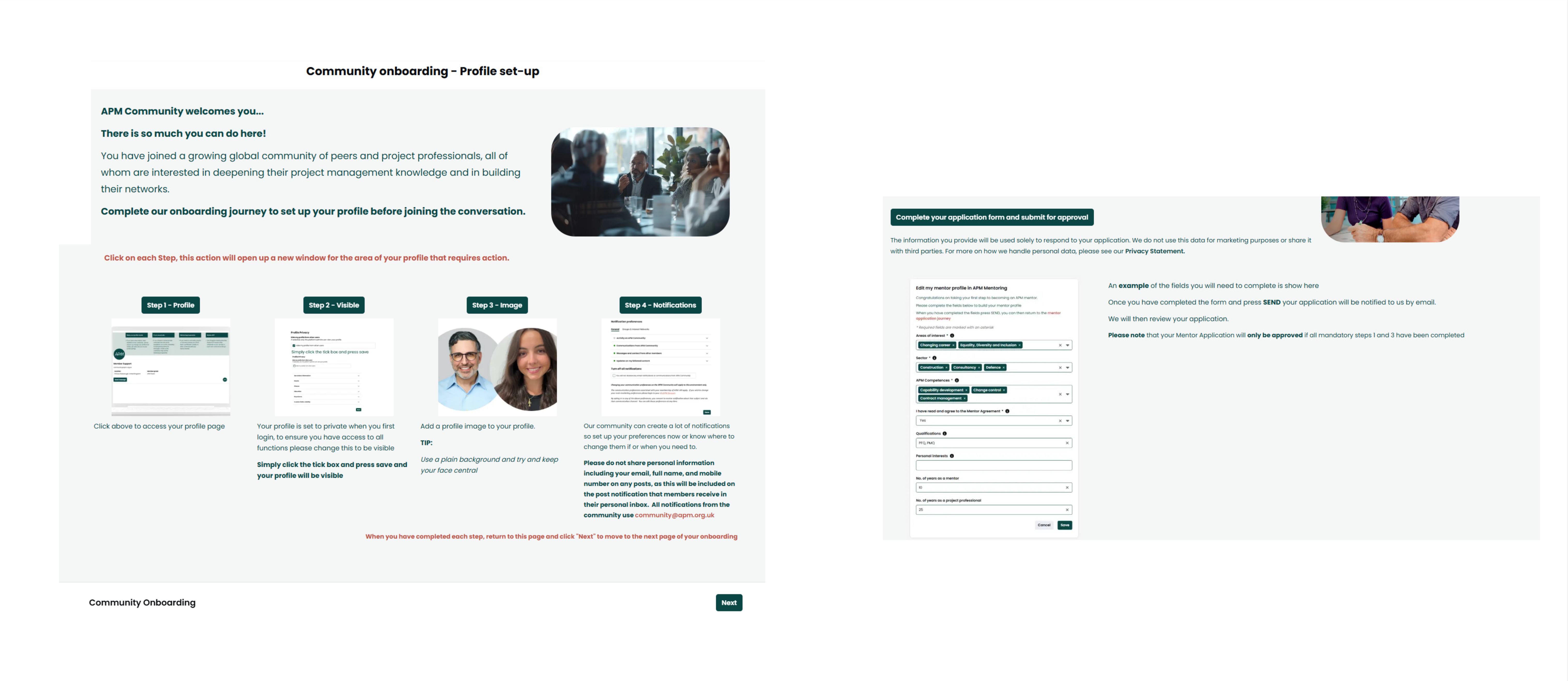
The onboarding journey highlighted why this may be a problem.

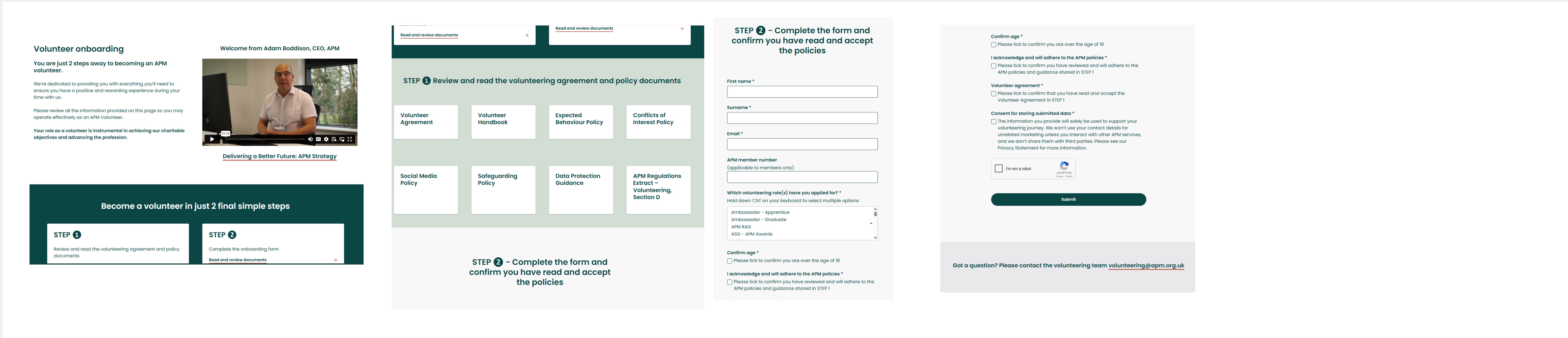
A major reliance of Community was volunteers. Volunteering was a major part of APM, it being a charity.
The process of volunteers signing up was next to be analysed.
---
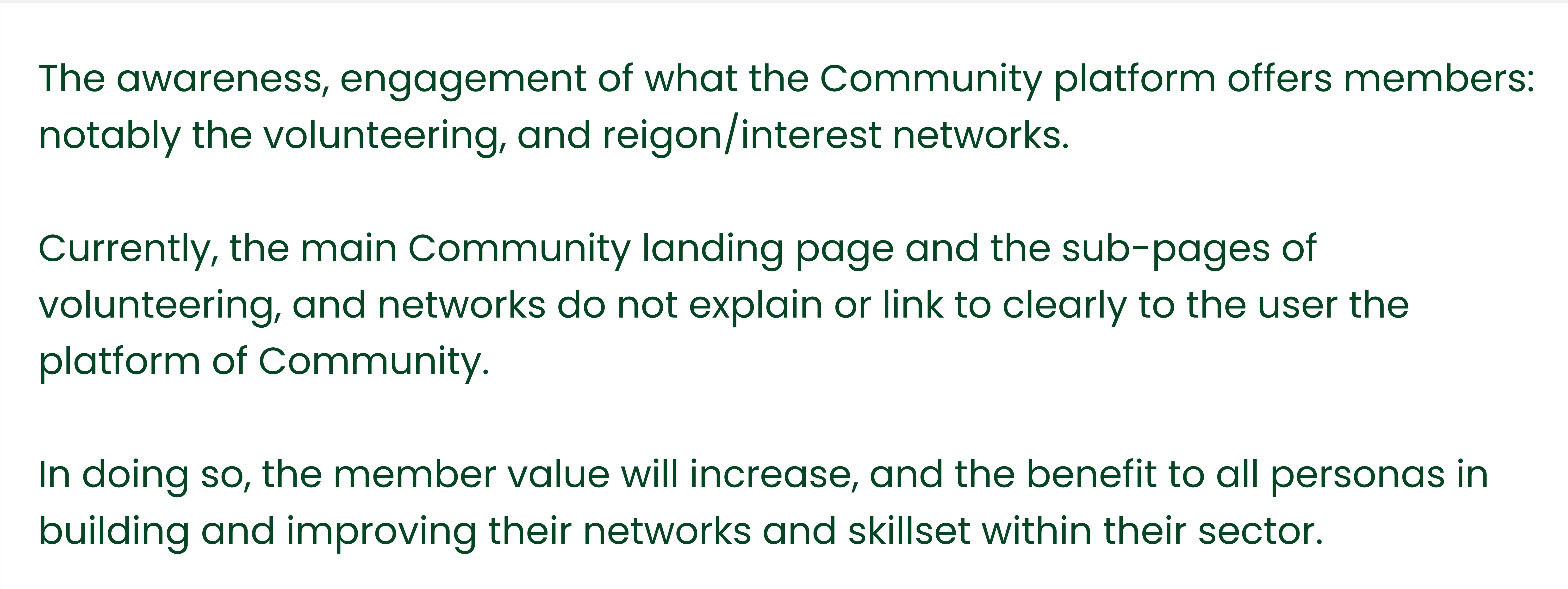
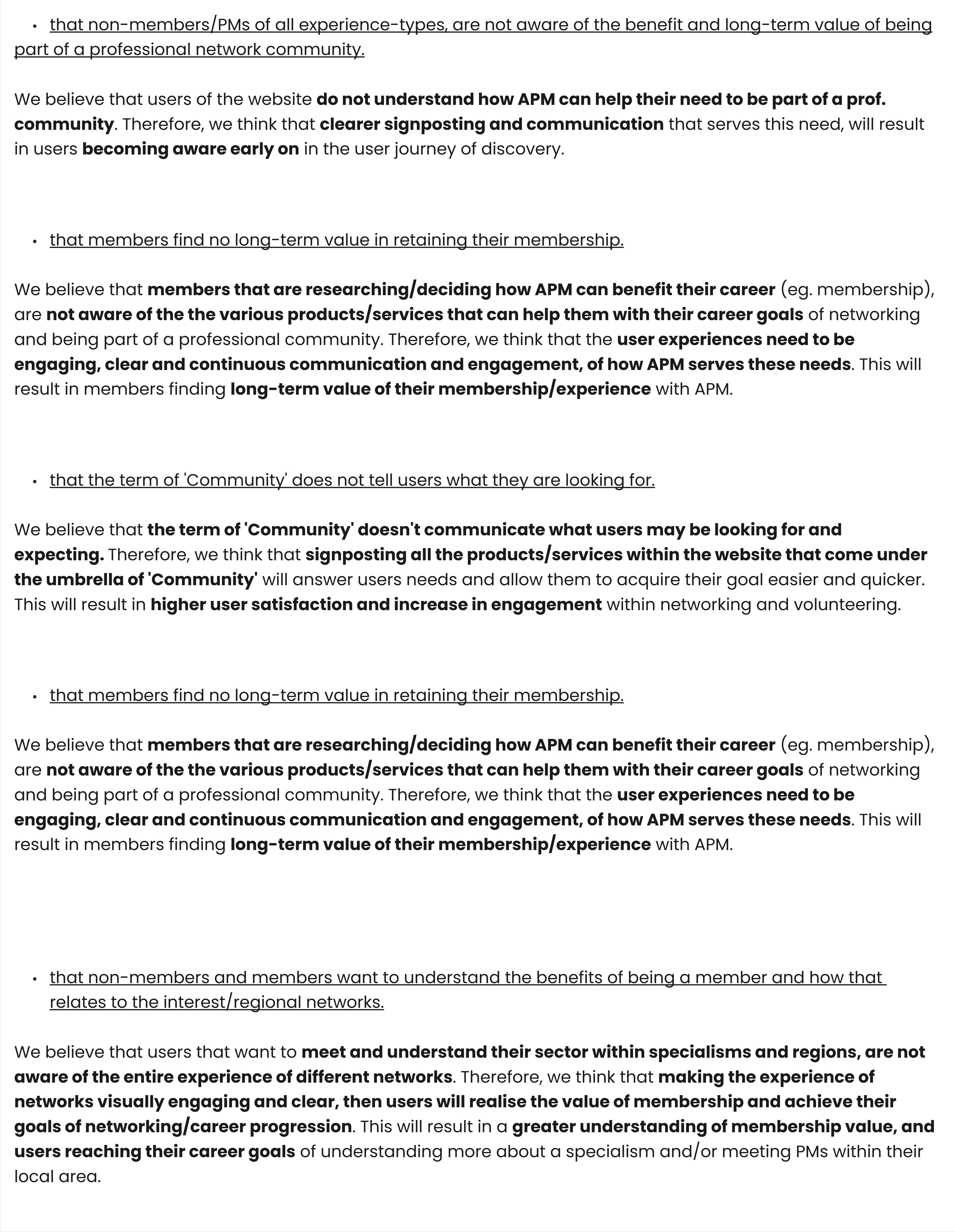
With all of this data and analysis collected, I then created a problem statement, goals and hypotheses regarding the problem.

However, I did not get to see any work through, having left the company shortly after and prioritised to other work.

.png)


.png)