Web Design
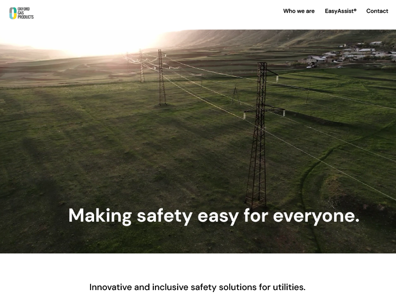
Bringing branding and usability to an Oxford Uni startup: gaitQ medical device website design (B2C)


As the designer at OPD, I was asked to use the gaitQ (an Oxford start-up client) branding guidelines and understanding of its MVP, to create a sitemap and high-fidelity wireframes for a soft launch of their website.
The design need was that of an MVP website: enough design to showcase the company, its beginnings and what it was doing, with the scalability to allow it to add content and expand when necessary.
As a start-up, it had limited funds but needed smart marketing design to show that it knew what it was doing to encourage more investors. The site-map proposed helped to show the client what was going to be created and what they needed to do.
Below is the proposed site map diagram.

gaitQ's end user were PwP (People with Parkinsons): as a product and brand already had a strong brand look. It was using aspects within the product design to bring forward into the website.
To make sure that the end users were first and foremost, to engage maximum empathy with the target website users.
I also took the photographs as seen here, along with their editing.
It was decided between Head of Design, myself and the client that a simple, scrollable story was what would be most effective: the main idea, the main problems the product is solving, the solution and the overall mission statement.
With the below branding style guide created, I then set upon making a low-fi prototype.


After client approval, I created a high-fi prototype.

Placeholder images and realistic placeholder text was used to give the idea a more complete vision of the end product once all content had been finalised by various stakeholders.
The photography direction was to keep the end user in focus, but with the message that using the product would benefit and enrich their lives.

The web design made responsive, suitable for mobile: investors can read from anywhere.Some of the more content dense pages, such as ‘team’, had to be configured in a way that lead to more interactivity between screen and viewer and progressive disclosure.
The deliverables were the original files, the overall presentation and a list of further content needed.
.jpeg)
The client felt that there was a blueprint for the marketing efforts, and gave them the vision they required about keeping focused on the end user.


.png)


.png)